

The Oregon State rebrand.
The Oregon State rebrand is now official. But tonight was the night they unveiled their uniforms. I didn’t get a chance to see all of them but the football uniforms were the ones that caught my attention — in all the wrong ways.
FOR PHOTOS OF ALL THE UNIFORMS, CLICK HERE
Before I begin, here are a couple more photos
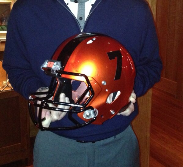
Not very impressive.
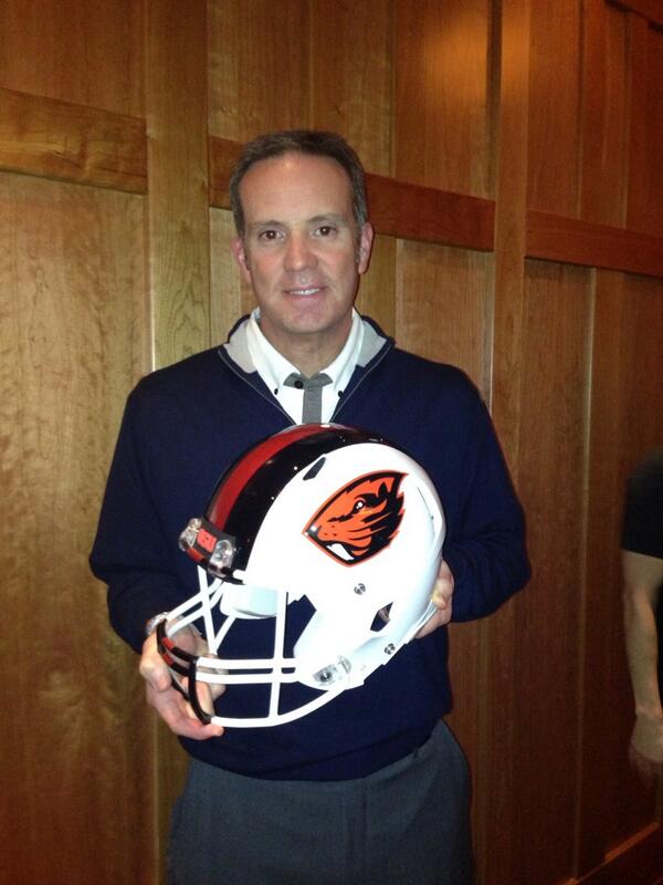
Logo is too small.
There are so many issues with this football set. The logo is too small on the white helmet. The orange helmet doesn’t have a logo. The black helmet has no logo. The inconsistencies of identity should be avoided. Matte and chrome?
The shoulder stripes don’t match well with the pants stripe. The white jersey is the only one with a word script. And somehow, someway, the three-toned facemask apparently is a good idea. Is it supposed to look like beaver teeth?
Nike gets the blame for most of this, but give some blame to the school for approving it.
I can see what direction they were trying to go with, but it’s too muddled. I’m not a fan.
