Last night I started to think about the best helmets in NFL history. It was something that I decided to make a list of right here just because why not? The NFL helmet is the identity of the team. I remember the old Monday Night Football intros where both helmets crash into each other. That’s priceless.
So with that in mind, I’ve decided to create my own personal list of the Top 10 helmets in NFL history that I think stand the test of time. Feel free to disagree with me here.
Before I begin, here are some basic criteria that I used to determine which helmets should be on the list.
- Logo design on helmet has to be unique and instantly recognizable.
- Color scheme is very important.
- Great memories to an extent in terms of when the helmet was worn.
- Simplicity.
With those criteria, here are my top 10 NFL helmets of all time.
10- Chargers (1961-65, 1967-1973)
Why I like this helmet: Thanks in part to the Chargers wearing them as throwbacks in recent years, this helmet is unique because not only does it feature their classic lightning bolt on a white helmet, but the player number gives it a great unique look. Simple and classic and a great balance to their uniforms.
Why I like this helmet: What stands out about this helmet is not only do the Redskins have a great color scheme in burgundy and gold, but instead of an image of an actual Native American, a spear captures the image of bravery of the name. Too bad they only had this for a few years. If they kept it, would the name change demand be as high today?
Why I like this helmet: A modern classic and a shame they got away from it. Even when they added the teal flakes, the identity was solid. An all black lid with in my opinion one of the better logos in NFL history. It paired nicely with their classic uniforms. But more importantly, it showed how good a simple black helmet can be.
Why I like this helmet: Instead of slapping on a team logo, the Rams decided to use a decal that looked like a Rams horn. They’ve kept that design throughout their entire existence as the Rams and the gold ones are so iconic. It balanced well with the horned sleeves and when the linemen were in their stance, the horns really stood out.
Why I like this helmet: They’ve had this helmet shell design longer than indicated, but what really set this helmet apart was the adaptation of the black facemask. Featuring a logo that embodies the city (on one side, which is very unique) and a simple gold stripe down the middle gives it a great touch. What really makes it stand out? The uniform number above the nose bumper.
Why I like this helmet: Much like the Rams helmet, adding a feature of the animal the team is named after is great. The wings on the helmet is so iconic and the shade of green with silver is perfect. And of course, this also made this design so good.
Why I like this helmet: I am glad the Bills revived this look but it would have been so much better if they stuck with the blue facemask. That is what makes this helmet stand out. The balance of a blue facemask on a white shell with the charging buffalo gives this team one of the most recognizable looks in league history.
Why I like this helmet: Our last image of the Oilers in Houston is this helmet. Like the Bills, the balance of a white shell with a colored facemask makes all the different. Not only that, the color scheme for this team is so good that the Titans essentially kept it. The helmet stripe down the middle also matched the stripes throughout the uniform, which essentially gave them a perfect symmetrical design.
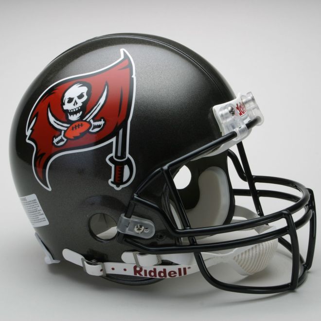
Why I like this helmet: The entire rebrand from the creamsicle era was a huge success. Everything about the team’s new look is a smash but the helmet is what takes the cake. How often do you see pewter used in professional sports? I can’t think of one. The logo captures the identity of a pirate so well. A skull, two swords and adding the football gives it an oh so perfect look — that all on a flag itself. The colors are great and I hope they never change it.
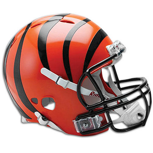
Why I like this helmet: In their first year in this, they went to the Super Bowl. They finally shed the bitterness of a helmet design by Paul Brown and captured their team identity so well. The team colors were perfect for a tiger-striped helmet design. There was no need to slap on any kind of logo onto this. When you saw the stripes, you knew it was the Bengals. The design has stood the test of time and it should stay that way forever. It may be one of the greatest uniform design ideas ever.
That’s my list. What is your list? Tell me in the comments.


