

You want to talk about breaking the mold and standing out? The Arizona Diamondbacks did just that with their newest uniform set. There are a lot of different things going on and much to discuss.
The new wordmark is fine. It’s not too crazy and it still takes a little hint of the old design. I am fine with it.
The logo also is nice return of the snake head.
Now let’s just talk about the common designs for each uniform before we look at them individually.
The first thing that is most noticeable is their diamond snakeskin pattern that goes on the jersey and pants. It’s a first any team in MLB history and it really gives the uniform a spring training look rather than a regular season look. In theory, it’s a pretty unique idea but it’s not executed well. You can see it go either on the shoulder for some of the jerseys or on the back for other ones. Then they have the piping down the side of the jersey to match with the diamonds on the bottom of the pant legs (which in turn is designed to match the cleats).
Oh and hey, don’t forget it’s on the caps too! (And they have a ton of caps too, which I will address.)
Not only are the D-backs adding these elements to their identity, but they are trying make “fetch” happen. I don’t know if this design serves any purpose but to be different. Maybe that is the goal. We know these uniforms will stand out playing against a traditional looking like the Cardinals. We’ll see how these will look.
In addition to these new snakeskin elements, the piping on the pants are cut off.
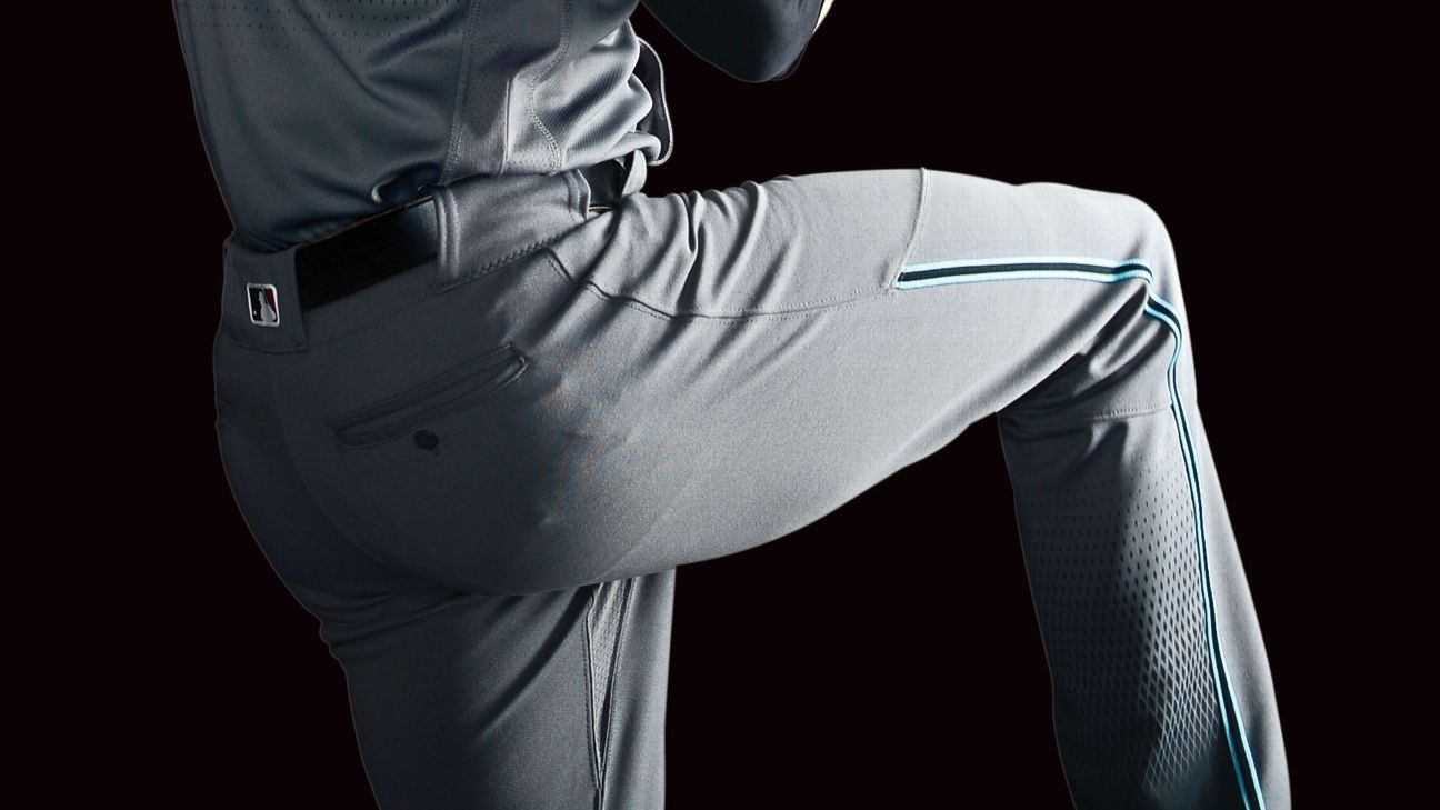
Players who wear their high socks will end up cutting even more of the piping off. Totally unnecessary and pointless.
===
Now let’s get to their EIGHT uniforms.
HOME
I just can’t get over this snakeskin yoke. It looks OK considering all the changes. But I think that it will take some time for me to get used to it. Notice the sleeve stripes and how it cuts off much like the pants piping. Not good.
In addition to this, the D-backs can mix and match their different caps with it. Oh that will be fun!
ROAD
This is nearly a color swap from the home uniform except for the wordmark. And the D-backs have used a darker shade of gray. I actually don’t mind the new shade but I still don’t understand why they would need to do it.
BLACK ALT
The problem I have with this alt (which can be worn at home or the road) is that it looks like a BP jersey. It’s so plain and uninspiring. The issue comes from the over-design. If there were less things going on and it was simple, then I can dig it. But it doesn’t give me that feeling.
RED ALT
Same as the black alt. It’s not as bad looking but still it isn’t all that great.
SPANISH ALT
What’s the point of this? None. And I am not a fan of any translation that is “Los” anything.
THROWBACK
Gorgeous. They should have never left this as their full-time identity.
===
Nope.
HOME ALT
Is this necessary? The previously mentioned identity featured no teal at all. But with the desire to include teal (from their original look) into this new look, they now have a new cap and this uniform to make it happen. It’s forced and totally unnecessary. Adding a teal trim here and there and changing up the snakeskin pattern does not make it better.
I will give this one a pass since teal is rare in baseball and this is refreshing to see that color. In fact, if they was the primary home set instead, I wouldn’t be as disappointed. But it’s part of this message identity.
(But the crazy thing is that I like the cap by itself. Not with the rest. But by itself, it’s not bad.)
ROAD ALT
Because of this teal inclusion, we get a road alt as well. And I feel like with the darkness of the gray uniform, it feels like some kind of glow in the dark effect or something of that sort. It’s very distracting.
But what I like about these alts is that the snakeskin design on the shoulder gets moved to the back. So the front of the uniform looks a little normal.
===
CAPS
We have two caps with the snakeskin effect. We have two caps that don’t have that effect. We have one with the teal trim. We have one for a throwback. We have one for BP and occasional regular season games. That’s a lot of caps. That’s a lot of merchandise sales.
Let’s take a look at that BP cap though.
It features the snake which is very nice. And notice the National League logo on the side. That’s a first. Will all BP caps look featuring something like that? It’s very possible.
===
Overall this is a mess. There are some things I like (such as the inclusion of teal) but there are things I am not digging (such as the excessive snakeskin and truncated piping).
But one thing that I have to remember is that until I see these in action on the field, I can’t fully give a proper assessment. But based on what we’ve seen today, this isn’t to my liking.
