
Earlier this month, MLB’s Mother’s Day caps for this season was revealed on Macy’s website. It’s basically every team’s current caps except the logos now feature pink. Not very creative but it does exactly what it needs to do to be different and enough to build merchandising revenue.
However, as you can see above, the Oakland A’s cap does not feature their current logo.
The logo you see is the “O” from the script the team wore during their early years in Oakland.
Take a look at the “O” on that uniform and the “O” on the cap. It’s basically a stripped down version without the border. In fact, if the A’s were to adopt the Mother’s Day cap design but put it in team colors, you would get something like this.

This cap is sold by Oaklandish, a local style company in Oakland. If you take a look at this design, instantly it would be a massive upgrade over what the A’s currently wear on the road.
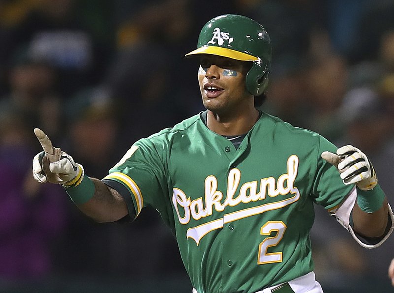
For the 2014 season and since then, the A’s have worn an all green cap with the A’s logo centered in white with a yellow/gold outline. It unfortunately doesn’t match the road set as it only matches with the green jersey. Prior the change, the A’s had an all green cap with the team logo in yellow/gold that worked very well.
What is interesting for the A’s is that since their move to Oakland, the team has always had either the “A” or “A’s” on their caps. It is much more common around the league for teams to have caps featuring initials representing the city they are from. You have the iconic “NY” of the Yankees or the “LA” of the Dodgers. The A’s, of course, notorious for being different, instead went with the team name on their cap. And for most of their time in Oakland, went with the nickname of their team name on the caps. It’s an iconic look and even though it is different from pretty much all other teams, it works for them.
Does this Mother’s Day cap signify that the team is moving away from their iconic look? Probably not. But it does open up the potential opportunity to at least adopt the cap for road games. What the team wears at home is an established look that has no reason to be changed. It’s now become an iconic part of the team identity and should not change (unless the team goes to Kelly green full time, the basic essence of the cap should still remain.)
But what if we adopted the Oaklandish design for the road? It would take back the much more fitting design concept of green cap and yellow/gold lettering but change it up with the “O” to match practice of most other teams. It works especially since it’s for the road and usually road uniforms stick with the city name. The only issue from this is that the team’s chest word mark would not match it at all.
Would the A’s change their road uniform look to match the cap? That would be a major shift in their identity adopting an old script font when they have a completely different font for home. So it would be unlikely that the team does make a change to match the Mother’s Day cap concept. But if the opportunity to break away from their current alternate set and use this idea as a replacement, it could work.
I’d welcome this Oaklandish cap as an alternate. I am not sure it would work well if it was a replacement for their current cap as the font would not match. But if they try to adopt it as an alternate, I’d be excited to see what they come up with.

/cdn.vox-cdn.com/uploads/chorus_image/image/65249851/usa_today_13361987.0.jpg)
/cdn.vox-cdn.com/uploads/chorus_image/image/49019371/GettyImages-111908872.0.jpg)
/cdn.vox-cdn.com/photo_images/7524861/146609666.jpg)
/cdn.vox-cdn.com/uploads/chorus_image/image/69027287/1276716980.jpg.0.jpg)
/cdn.vox-cdn.com/uploads/chorus_image/image/68795334/974041280.jpg.0.jpg)