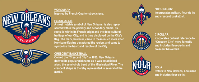
The New Orleans Pelicans logos are out and thanks to Sportslogos.net, we get a look at all the logos.
Here are my thoughts on all of them.
- Primary: The colors work well and the addition of the Fleur-de-lis into it is a perfect add to the city. The font used fits well, like one of those big boats that go up the river and signs along the French quarters. I don’t know about an angry looking pelican, but the bill works out well going into the basketball. I don’t know if the basketball is necessary but overall, this is a good logo. It’s not great, but for a rebrand, this works.
(The bird and ball also stand as a logo itself, making it five total in the new identity.) - Secondary with NOLA: Glad they continued with the Fleur-de-lis and using the city’s nickname of NOLA. And once again, the addition of a basketball. Simple and could go very well on the shorts or potentially as a back logo above the nameplate.
- Secondary with Crescent City: This is the first time any New Orleans sports team promoted that nickname with their identity. You can see the crescent moon in the ball. I actually think this logo is very unnecessary. A third alternate logo doesn’t need to happen.
- Secondary with pelican: This might be their best alternate. The Fleur-de-lis with the pelican works together so well. It actually looks like the pelican is a monk with his hood on. But regardless, it takes the team mascot and a city identity into one. I can dig this.
The uniforms won’t be unveiled yet so we’ll wait on that. But the great selection of team color gives me hope that this uniform will be a good one.
If I had to grade these logos, it’s a B-plus for me. The uniform will give me the ultimate conclusion of this rebranding.

