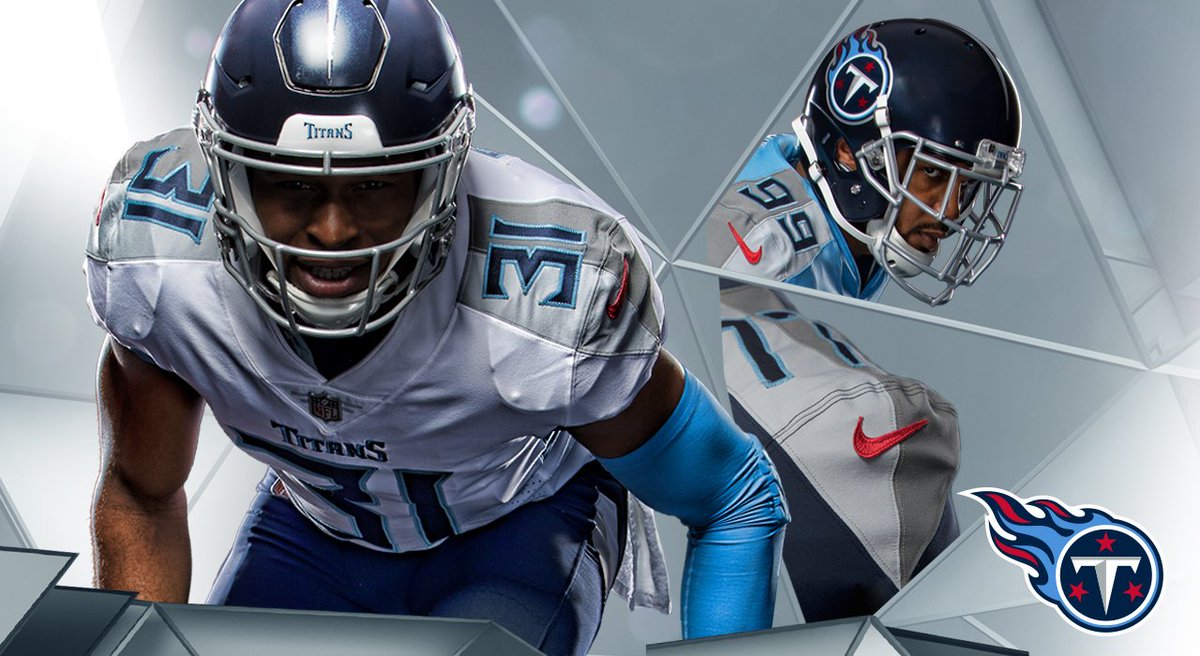
I could go into a long detailed post about these uniforms but I won’t. The team kept the same colors but just moved some things here and there and added that silver sword to the yokes.
But here are my initial thoughts:
HELMETS: Yes, the navy makes the logo stand out better but I wish they kept it white. I feel that it pays homage to the Houston Oilers before they moved. Navy is good, but I didn’t think they had to make the change. And also, that sword taper along the top of the helmet works only because the facemask is the same color.
JERSEYS: The sword thing I don’t like. The number font is too thin and not very appealing. That red Nike logo is so forced. The side panel makes no sense. There are just too many colors going on.
PANTS: The silver “striping” down the pants doesn’t do it for me. I really think the silver color needs to be limited on this uniform.
SOCKS: Same as before, which I guess is fine.
Overall, I don’t think it’s a great look. It’s similar enough to their old set in terms of color balance but that sword yoke doesn’t work for me at all. The helmet I can probably get used to, but overall, I am not a fan.
It could have been so much more but it fell a yard short for me.