
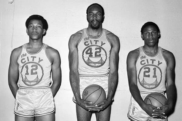
In 2010, the Golden State Warriors introduced a new logo and a new uniform set. The logo pay tribute to their famous “The City” logo. In fact, they went a step further with the placement of the logo on their jersey.
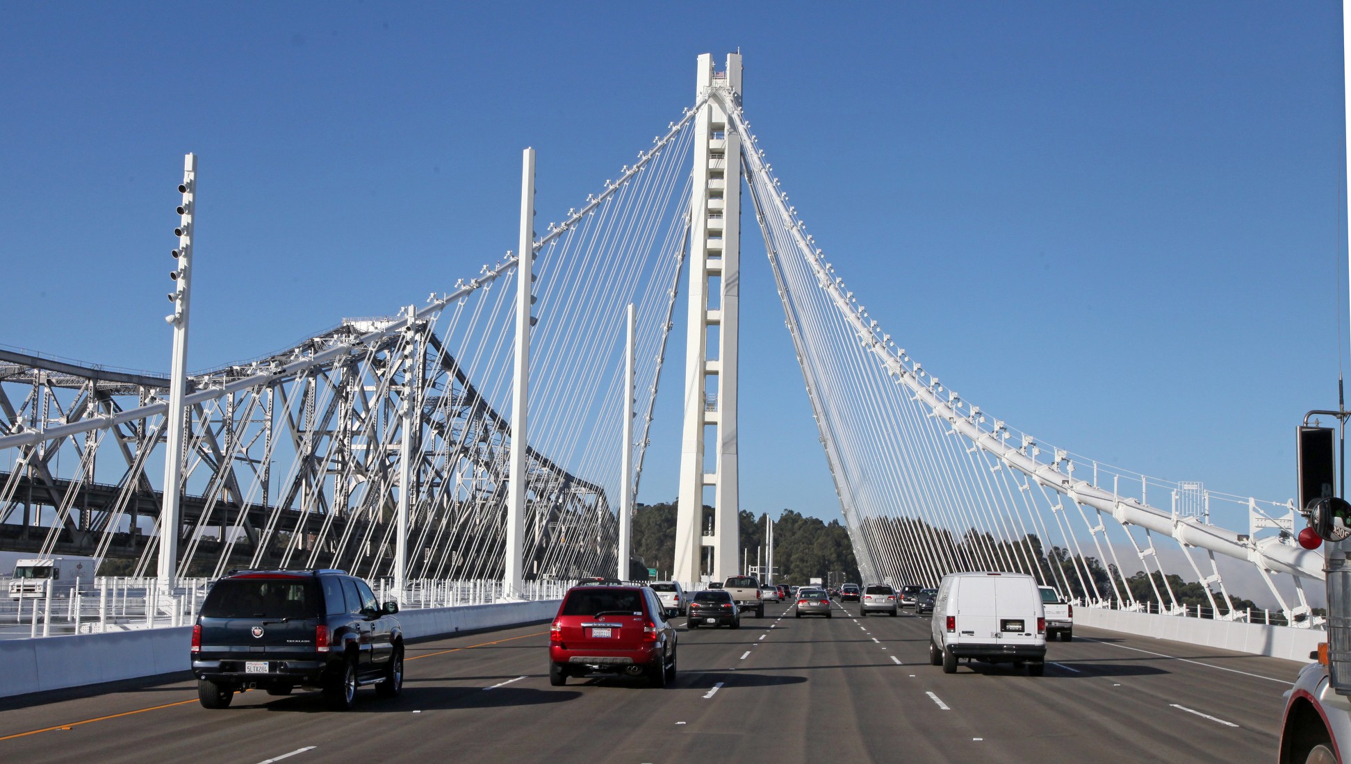
The funny thing about this logo was that the bridge featured on it had not even opened yet. Finally, in 2013, that bridge opened.
Coinciding with their move to the Chase Center in San Francisco, Chris Creamer is reporting that the team has filed a trademark on logos for next season. The team uniforms will also be altered to reflect these changes.

There are two major changes to the old logo compared to the new one. The font is now different. Gone is the Copperplate Gothic font and in is this new font that has a more old school feel. Copperplate Gothic wasn’t a good font to begin with but this new font doesn’t feel that much of a change that felt necessary. It’s a lateral move.
The other change is the bridge. I had initially thought that they were implementing the San Francisco side of the Bay Bridge since they were moving there, but I was later corrected and was pointed out that the team is just adding more detail to the Oakland side of the bridge’s tower. They have made the amount of cables and made them thicker. In addition, they added more details of the tower into the logo. Adding this detail seems like a good move but they didn’t have to go that route. With a thicker font, making the cables thicker made sense for overall cohesion. It’s a change that was necessitated with the font change.
What does that mean? It is common for teams to change their uniforms when moving to a new arena or ballpark. This move goes along with that. But subtle changes like this is an odd choice given that the Warriors have become a big international brand. Modifying the primary logo in anyway is something I didn’t expect. What this also means is that Nike will create new uniforms to coincide with this. It may also boost merchandise sales with the new logo. We don’t know how much of the uniforms will change. Will they just make minor adjustments or will it be a completely new look? We will see.
In addition to the primary logo change, the Warriors will also have these other logos.

The logo on the bottom right is the new logo without the wordmark. There isn’t much to discuss there.
But what is interesting is that the “W” logo features the letter “W” that is different from the one in the primary logo. The serifs of the alternate logo point inward whereas the primary logo has the serifs pointing in the same direction. This “W” logo is fine but it really isn’t much to get excited about.
Then there is “The Bay” logo. I get it. Include a basketball and the ocean and you automatically think about the Warriors. But this 1980s design just feels out of place. It just feels like a logo just to have so the people The Bay can all claim the team.
Overall, it’s minor changes that aren’t drastically shocking. Copperplate Gothic wasn’t a good font to start with so a change to that made sense. And with that change, having the cohesion with the bridge also makes sense. The new alternate logos are just fine but nothing to get real excited about. They didn’t have to make any changes but since they did, they made minor ones that in a sense “cleaned up” the previous set.
But hey, they kept the Oakland side of the Bay Bridge after all. Changing that to the San Francisco side (which would make a ton of sense since the new arena is near it) or the Golden Gate Bridge may have been a much more logical move. But that would require too much change. Or maybe the team really wants to acknowledge their Oakland roots.
We will find out their reasoning when the logo and uniforms are officially unveiled.
