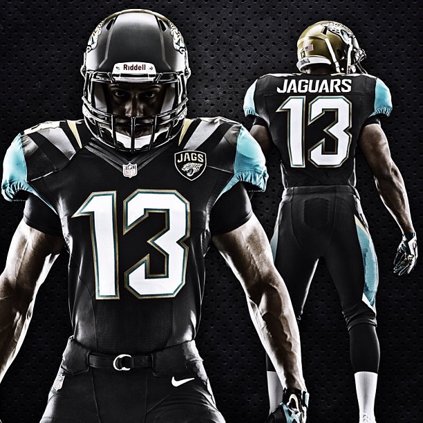
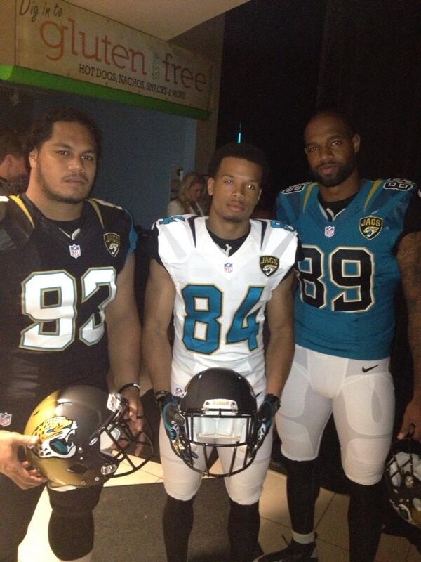
After weeks of teasing elements of their new uniform, the Jacksonville Jaguars officially unveiled the entire set and I must say, the word “revolutionary” might be one of the best verbs to describe this set. Overall, I have never seen anything like it, but it meets my approval. Even though it’s kind of AFL-like, it works for a team that doesn’t have decades of history.
Let me break down the components of the uniform. (The teal jerseys will be worn only once a year. I assume they’ll save it for the primetime games.)
First, here are some additional images via tweets on the new uniform. (HERE IS NIKE’S PRESS RELEASE)
WATCH THE VIDEO HERE.
GO THROUGH GALLERY HERE.
https://twitter.com/Uniformswag/status/326757360028745729
HELMET: The rumored two-tone helmet is true. As you can see, it’s matte black in the front and it fades to gold towards the back. I don’t like matte at all. This is a very strange look but I think I will have to reserve judgment until I see it on the field. But so far, a simple all black helmet would have been better. This is OK and wasn’t necessary.
UPPER BODY: I love that there is a little bit of everything there. The small gold sliver around the collar is a good touch. (It’s black on the white uniforms, gold on teal alternates.) The entire shoulder sleeve of teal also works since it fits with Nike’s new shoulder template. That “chrome” finish is subtle so it really isn’t as bad as I first thought by the leaks.
The team wanted to add a patch and they made it work. The Jaguar on the patch faces the heart, just like it does in the military. I am glad that the flywire collar doesn’t interrupt anything. This I approve.
SIDE: Simple without clutter. I like it.
BACK AND UNIFORM NUMBERS: I like that the collar remains all uniform with the rest of the jersey. The numbers look great and I do enjoy that it features all three prominent colors. The road set features teal numbers, which is amazing. The teal jersey features black numbers, which is OK. But overall, this is not bad. I am glad the nameplate is one singular color.
PANTS: The piping is nice and simple. They’re pairing black socks with both pants options.
Overall, this entire set is futuristic in a way. It’s Nike and it works. Sure it doesn’t have this great classic look, but for a team looking for a new identity, it works. I approve of this and I think that overall, it’s good. Much like the Seahawks last year, I think it’s an acquired taste. The helmet is still a mystery to me, but I think I can accept this going forward.
If I had to grade this, I’ll give it a B.
And as for the Vikings and Dolphins, I’ll get to them when they are officially unveiled. But here’s a sneak peek.


