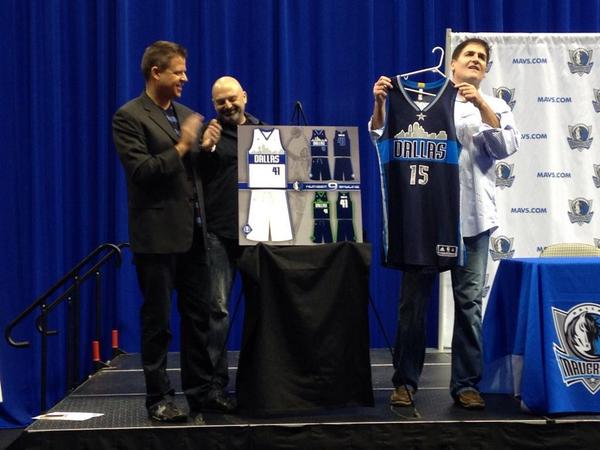
Remember when Mark Cuban had a design contest for new uniforms? Those new uniforms were unveiled today. The dark blue ones will be worn in the 2015-16 season and the other ones might be worn in the following season.
I don’t mind the skyline, but it looks so boring. The font is uninspiring, the colors are still drab and I don’t think adding more blue to an identity is great. A gray set might have worked.
This just shows that the creativity (or Cuban’s taste) are very poor. The lime green alt looks even worse. What was Cuban thinking? These are just bad.

