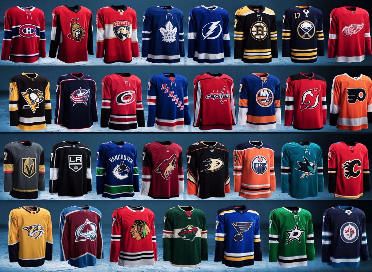
I was out for most of the day so I have not given myself enough time to go over all that’s happened. Chris Creamer in the tweet above covers everything you need to know.
But here are some quick thoughts.
- I am not a big fan of the collars but it isn’t too bad. I do not like the new laces for the collars but it was inevitable that this was going to happen.
- The perforated numbers on some of these look OK. I know that the crests and fabrics are lighter because some crests aren’t all fully stitched like before. From a distance it looks fine.
- I am OK with the NHL shield being Chromaflex.
- Most of the changes that have been made are good. I like the Canes’ flag stripe, the new Wild set, the Avs’ old school style return. I don’t like what the Devils did.
- The Golden Knights look OK. Nothing too flashy and the details are nice. But overall, I am not really big on it.
For the most part, these are fine. Sure the two-tone collars for some and the change of certain fonts are decent, but it isn’t something too big. For what it is, Adidas didn’t make a big splash and didn’t force three stripes anywhere. So because nothing big was implemented or forced by Adidas, I call it a success.

